Modeling & Materials Logo


Solana Vella's Weekly Design Challenge Template
Below you will find my design challenges, workshops, and final projects.


Module 2


This document outlines the objectives and deliverables for Module 2 of the Modeling & Materials course.
These images talk about What makes the space interesting?, What do people do in the space?, What fills up the space?, How do they make users feel?
What are the functions of the space?, Are they aesthetically pleasing? Overall, explaining why these images were selected as a part of this challenge!

Design Challenge 1
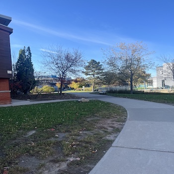
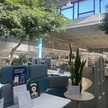
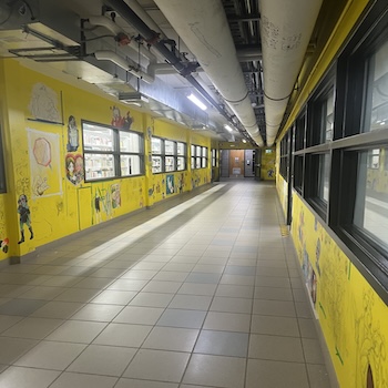
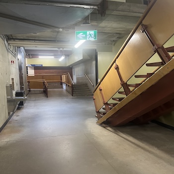
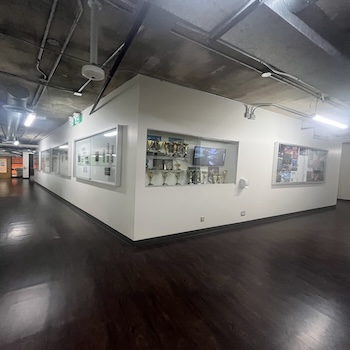
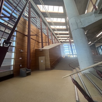
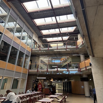
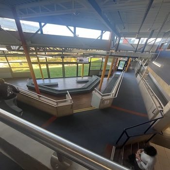
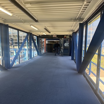
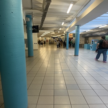
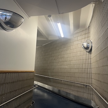
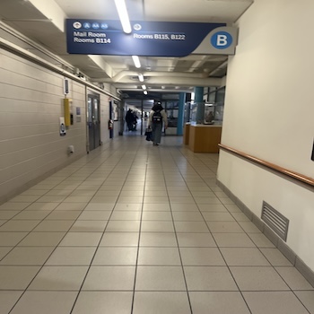
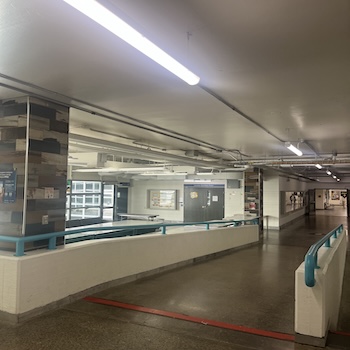
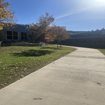
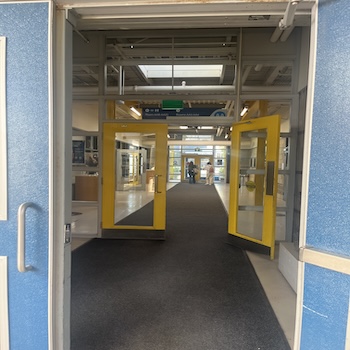
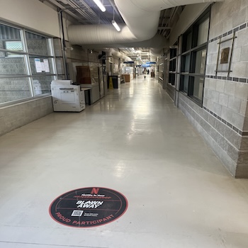
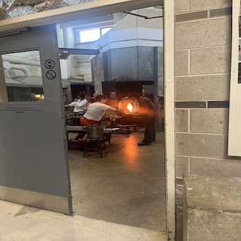
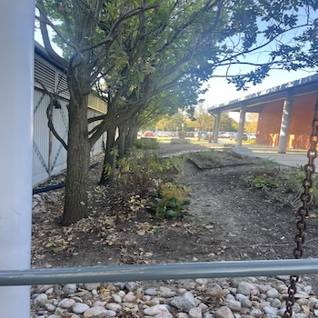
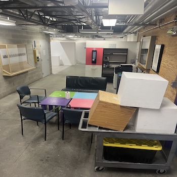
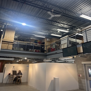
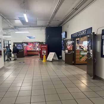
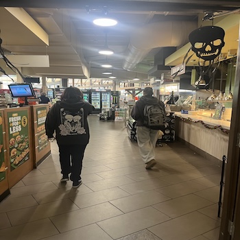
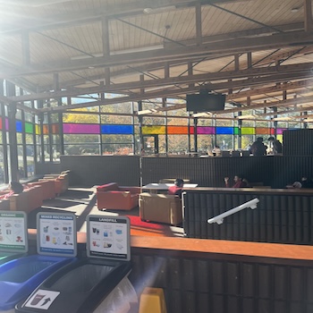
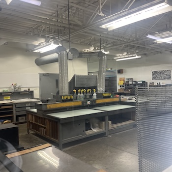
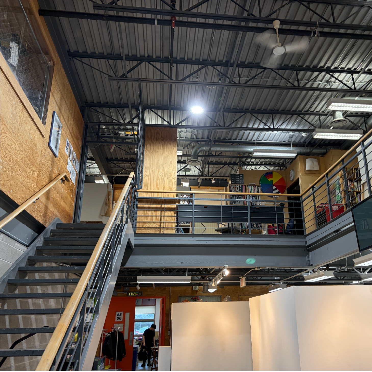
This hallway spans across the J wing at Trafalgar. The doors along the left lead into the dance studios with large rooms. There are benches along the whole right side of the hallway for students to use. The architecture in this picture is quite interesting, as it has colourful paint to make it seem more cheerful for students. - Cole This is a pathway that sits in the centre of the campus. It takes you straight through all the wings, and from where it is taken, you can get all the way to the athletics centre if you keep walking the whole way. Some bridges veer off to each wing. This is important as there is a little river that also runs through campus. The trees and plants make this an enjoyable path to take through campus. - Cole This is the library at the Trafalgar campus, where students can come and do their work in a quiet space. The environment in this space is welcoming because it has greenery to make it feel calm. There are nice large windows to bring in natural lighting. I feel good being in this space, and I would be productive here. - Cole This here is the infamous tech hall. Every year they paint over the illustrations in bright paint. Then students are allowed to use these walls to draw/paint/sketch whatever they please. I think it is quite interesting because it is a way for students in an art school to showcase their work in a way that in some places might not be acceptable. I was told last year when I first started that they do this so students don't vandalize other parts of the campus. If they want to do it, they do it here. I feel like this space is for the students, so I feel welcome as a designer myself. - Cole Coming out of the yellow hall, if you turn right, we have this hall in the S wing. It might look bland aesthetically compared to where you came from previously, but functionally it is very important. It has a ramp for those who cannot use the stairs and also leads to the residence. On the left, it also has a water fountain for public use. I used this hall a lot to get into the residence building when I lived there last year. - Cole This hall is in the S wing, where it has display cases along the front, and then student work all the way down the right wall. I feel that this hallway is positive because it showcases achievements from students. The current students who are walking in the hall can see that others have been successful, which makes them more encouraged. - Cole This is the foyer in the S wing. This is likely to be the first place students go when they want to go to the campus, as it is right next to the main parking lot and public transit transfer point. The building has lots of natural light shining down from the ceiling. The ceiling is also very high, giving off the feeling that the space is much larger than it may seem. This space feels welcoming, and that's good considering it is used for events in the large screening room on the left. Many events are held here throughout the year. - Cole Just around the hall from the entrance to the S wing is this area. Similarly, the lighting is good because it has windows on the ceiling providing natural light below. You can see many students doing work at the tables, making it a nice space where you feel okay as a student to get work done. There are also bridges above connecting hallways to rooms on floors above. Behind the tables is an old coffee shop that is no longer running. I feel like it is unfortunate that they never had anything reopen in this space for the two years I’ve been here. I say this because the campus needs an additional coffee shop, as the Tim Hortons is constantly busy. That part of the space is, in a way, wasted and could be used for something else. Maybe some more tables for work? Or reopen a shop? - Cole This space is a common sitting area around the school. Its main function is for studying and a space for students to mingle and catch up on schoolwork. This function is utilized with seating surrounding the whole space, with added outlets on the wall behind them to encourage laptop use. There is also an extra seating area in the middle that faces inwards, making students feel more connected to talk and connect with others. This space is also welcoming, with a large window facing the river and foliage outside, making the area feel open and inviting for students passing by. - Solana  This space is one of the main hallways around the school. Students use it during break periods and to travel from one wing to another. Even though this space is just a hallway, the aesthetics surrounding the space create a feeling of calm because of all the windows that encourage students to look outside. This can be very useful during stressful times of the year, and it is helpful for students to have an area where they can take a minute and appreciate their surroundings. Something that also makes the space interesting, besides the windows, are the structural beams coming down from the ceiling. They create an interesting pattern that adds an extra element of appeal to the space. - Solana This space is one of the main hubs around the school. It is where the only Tim Hortons is, which is a main source of food for the Students at Sheridan, and it is where the service Hub is for students in need. This makes for a very busy space with lots of foot traffic throughout the day. What makes this space appealing is the smell of Tim Hortons and the food court that is down the hall, and the shade of blue that is around the space, creating a calming and relaxing space to hang out in before getting food. Another appealing element in the space is the gaming systems that are placed around the walls. They add a fun element to the space, and it encourages students to want to interact with the game; therefore, they will be brought further into the space. This space makes me feel welcome right away and that I am a part of a community because of how many students gather here. - Solana This is a hallway “shortcut” in the school, and it is utilized by students mainly during peak times of foot traffic during school hours, for example, during breaks or lunch. There are not many added elements to the space because it is meant for students to walk through quickly without bumping into anything. I do think the mirrors at the top of the wall demonstrate that this is a hallway people speed-walk through because there would be a lot of students bumping into each other if they couldn’t see who is coming on the other side. I also think the material on the walls is a nice added element because it is different from the rest of the school and makes the section feel like its own space. Overall, this hallway makes me feel comfortable in the school because it shows that I have been here long enough to stride through the area knowing where the end will take me. - Solana This next space is a hallway as well, and it is utilized to control the foot traffic that students create while trying to get to their classes. We chose this photo because of the items that fill up the space to guide students with direction and inspire them with the elements that are displayed. The directory guides students to where the hallway will take them and makes sure they feel like they are being navigated to the correct area of the school. There are also products of past students' work in this hallway that help fill the space and add more appeal while students/teachers are walking through it. This makes me feel like the school is proud of its students and the work they produce while in their program, and it shows how much of a community we share at this school. - Solana This space is a hub for students to hang out and finish their assignments. It is called the art pit, and it is utilized by students as a time to catch up on anything they need to do and display their art to other students. This space is very welcoming to students; however, I feel like it is more catered to art students because of the “light tables” for art paper and the tables all covered in paint. This is not necessarily a bad thing, but it might make students who aren't in an art program feel unwelcome. I do think that, because of how art-centred it is, it is very appealing because of the creative elements that are in the space and the large window that adds a light source that covers the space. I also like how the ramp represents leading lines and pushes students to go into the space rather than walking past it. Overall, this space makes me feel happy to know that there is a space for artists to create and not be isolated while doing their work. - Solana This space is set outside, and it is utilized as a pathway for students going between different wings around the campus. The space is filled with trees, rocks, and other greenery that is placed in an open field, there is also a part of a chair shown in the photo and that shows that chairs students are welcomed to sit on. What makes this space interesting is that, from the inside of the school, there are large windows that display this area all the time. So when students are walking down that hallway, they get a glimpse of this space and are naturally curious to see what is out there. This space gives me a feeling of refreshment; it gives me a nice break of fresh air instead of staying inside all day, and it motivates me to appreciate the aesthetics of the outdoor space. It also makes me feel like I am able to relax when things get stressful, and having the option to sit outside in this lovely space is comforting to me. - Solana This space is the entryway to the AA wing at Sheridan, and it is utilized by students coming in and out of the area to get to their classes or go home. Something interesting about this space is the colour switch from the outside doors to the inside doors. The outside doors are Sheridan’s signature blue, and the inside doors are yellow, as if it is trying to represent that it is a new section of the school the student is entering, so it lets the student know right away that this is a new area before even walking into the whole space. It also adds a nice appeal to the space because it makes the AA wing feel unified with yellow as its signature colour. I also appreciate the directory the space has right at the entrance to help guide the students. This space makes me feel a sense of belonging walking into it because of the warm colour scheme and light sources that are not so harsh on my eyes. The space is very soft to look at, and it makes me feel at ease right away, which is nice to include in the stressful environment school can have. - Solana This space is another hallway feature that is utilized in the AA wing as a form of transition between classes and different areas of the school for the students/teachers. This space is filled with printers, past students' work, garbage’s, and windows that help make the space feel “lived in”. This hallway also has a form of directory that helps students navigate around the area and not get lost. What makes this space interesting is how, at first glance, it makes me feel very tired just by looking at it, and it's daunting to see when I first arrive in the space. I do think overall the space is appealing because of all the added elements of students' work and the soft light the windows add to the space. One thing I think would improve the space is adding more soft lighting features other than a few overhead light sources. Maybe it could have a warmer light source in the corners of the ceiling so that there are no areas of the space that feel darker than others. - Solana This room is filled with students working with machinery and using big furnaces to make glass. In this workshop area, there are students hard at work with tools and safety equipment, and there are benches scattered around the room, where students can sit and work on their intricate glass pieces. This room makes me feel like there’s a lot of hard work taking place, and I feel like I’m in a hot, busy workplace like a factory. -Levi This area is an area outside the school, where there’s lots of vegetation and trees. The plants really bring the school to life and give students the feeling that they are in nature and make their walk around school more enjoyable. This makes me feel happy even though I’m in school and overwhelmed with school. These little areas can make me feel happier and fresher as I pass. -Levi This is a very interesting area just down the hall from our classroom. There are a lot of unique things in this building, as it is an artistic area of the school, where you can see students' work and art on display. You can see interesting shapes, colours, and spaces that really show the experimentation that takes place here. I feel like I can feel the artistry behind each aspect of this room and can really tell that there is a lot of creation happening. -Levi This is another picture from the same building. In this area, you can see an elevated area where there are a lot of books and materials that students can go and read. On the lower level, you can see a student hard at work painting something. This really makes me feel at home, as you can really feel that this is an area that is lived in, and it would be a really nice place to hang out and get lost in your work. -Levi This is a very popular area of the school located just outside the food court. There are a lot of doorways, paths, students walking, and signage that show that this is a popular area, where students are constantly passing and entering at different points. The feeling I get from this hallway is that it is very busy and almost makes me feel slightly overwhelmed because there’s so much happening, but also there’s familiarity because I pass this area so many times a day. -Levi  This is a picture of the inside of the food court area. There are a ton of advertisements and signs directing students to different storefronts and products. This creates the feeling that there are a lot of options and choices to satisfy your needs. There are also decorations around the area for the season that make the area more welcoming. This overall image makes me feel slightly overwhelmed by the choices and different deals happening, but it also provides me with the feeling that I have a lot of options and freedom to choose what I want to eat when I'm hungry. -Levi This is the seating area in the food court. This area is very well designed, as the whole wall is windows and bright coloured glass that allows for sunlight to pour in through and provide a warm and comfortable atmosphere that looks incredibly inviting. There is a lot of variety in the seating options, such as comfy armchairs in the carpeted areas for those who are working on schoolwork for longer periods of time and then the regular seating for those who are eating and are there for shorter periods of time. This whole area is just extremely comfortable and inviting for a variety of purposes. No matter what your need is, this area really provides you with the comfort you need to do it. -Levi The final image of a space we explored was this classroom that is used for printing. This is a very interesting space, as there are a lot of worktables, racks, spray bottles, cubbies, and prints on the wall that all show that this is a space used for printing. This area is very unique in that there are a lot of things very specific to the work the students would do. This area makes me feel like a lot of cool things happen here and makes me feel like I'm living in a classroom where students would enjoy going to work on something they're passionate about and provides them with a workplace to use their creativity and explore. -Levi

Design recommendations and possible solutions to specific spaces:
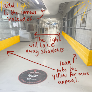
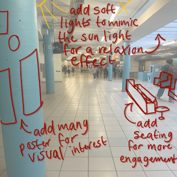
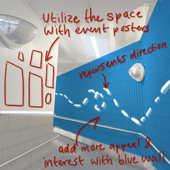
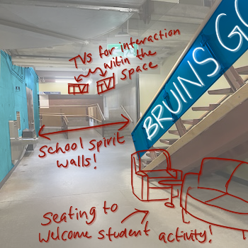
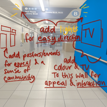
This image shows the possible design solutions I would add to this space. I feel like this design will add more life into the space and more welcoming for students. This image shows the possible design solutions I would add to this space. I feel like this design will encourage even more students to relax in this space and it will bring attention to events happening around the school. This image shows the possible design solutions I would add to this space. I feel like this design will add more appeal to the school and make students appricate this hallway even more! This image shows the possible design solutions I would add to this space. I feel like this design will create more buzz in this space because it is usually pretty empty and this design will encourage students to sit down in this area. This image shows the possible design solutions I would add to this space. I feel like this design will add more visual interest to this part of the school and will encourage students to stop and look at the artwork students have made and events happening around the school!

Design Challenge 2

put a description here or you will lose grades put a description here or you will lose grades put a description here or you will lose grades put a description here or you will lose grades put a description here or you will lose grades put a description here or you will lose grades put a description here or you will lose grades put a description here or you will lose grades put a description here or you will lose grades put a description here or you will lose grades put a description here or you will lose grades put a description here or you will lose grades put a description here or you will lose grades put a description here or you will lose grades put a description here or you will lose grades put a description here or you will lose grades put a description here or you will lose grades put a description here or you will lose grades put a description here or you will lose grades put a description here or you will lose grades put a description here or you will lose grades put a description here or you will lose grades put a description here or you will lose grades put a description here or you will lose grades put a description here or you will lose grades

Spatial Workshop 1

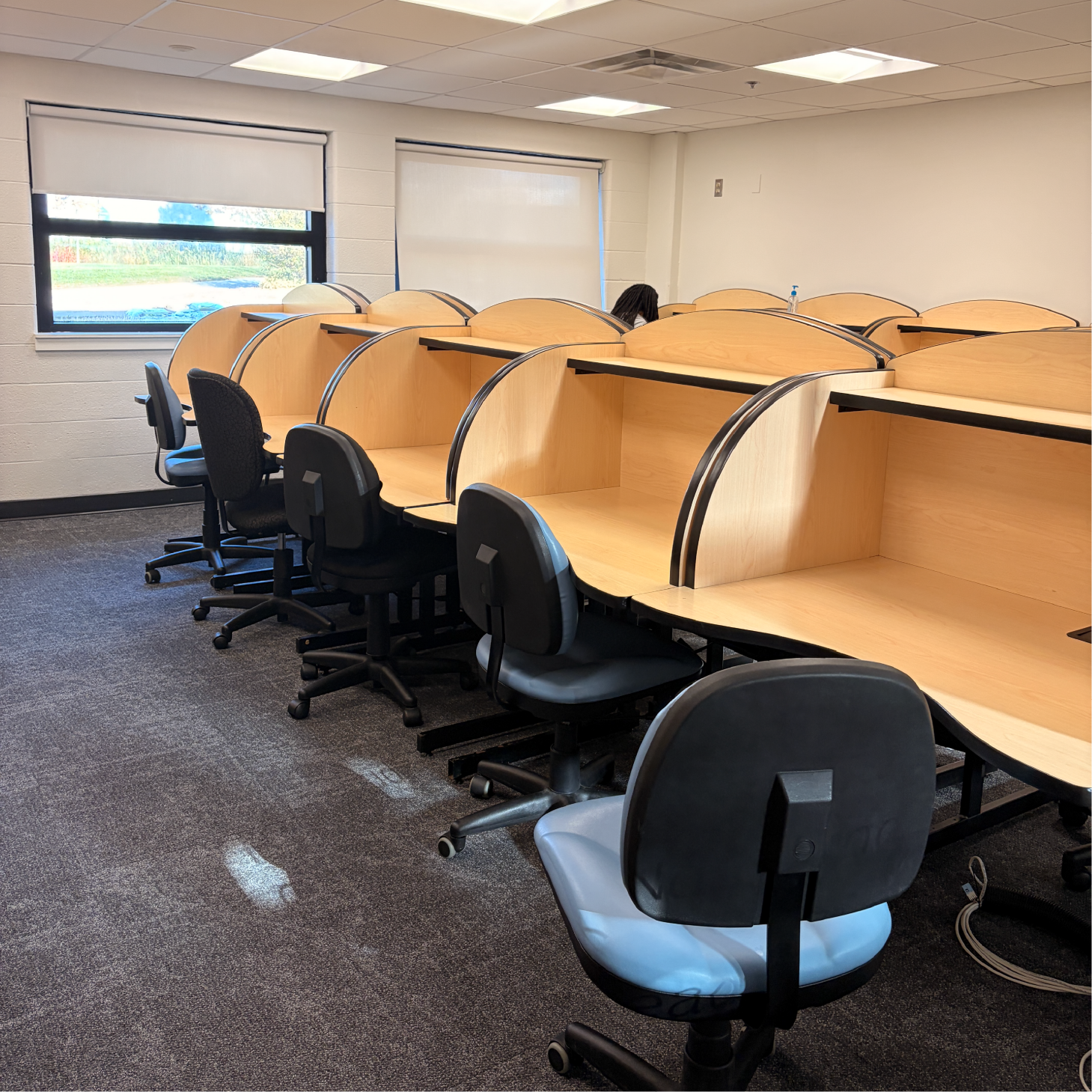
The architectural psychology on our campus effectively demonstrates how layouts and designs of spaces can enhance or inhibit learning. For example, as mentioned earlier, spaces that are closed off tend to be indicative of somewhere where conversation is not encouraged. Some spaces that come to mind are the Library Learning Commons or private bookable study areas. When looking to outdoor areas, it is evident that some areas encourage gathering together. Muskoka Chairs, benches, and stoops are all provided so that users can sit comfortably outdoors with natural light and open concepts (as it is outside), these locations often promote gathering and openly communicating with one another. Students are also able to navigate their space based on where the location of their class is. - Aubrie When conducting an analysis on all forms of Spatial psychology I found that I favoured environmental when looking at how spaces can affect people. It was very evident that factors like lighting, noise and temperature play a huge part as to how it affects peoples behaviours. For example, areas that are more high energy like the cafeteria during the lunch hour can often become an overstimulating environment as the bright lights and hot temperatures are calls for induced stress, whereas areas like the painting room in the A-S Wing are kept at a lower temperature and have more dimmed lights. The contrast between the two spaces are effective examples of how the environment of the space affects people more than its architectural layout. - Aubrie Landscape theory kind of ties in to the ideas of environmental psychology and architectural psychology, yet it mainly focuses on the arrangements of natural elements and how those arrangements can influence a persons experience within the campus. there are many areas that can be applicable to landscape theory. Indoors, we can think about areas like the library and how factors like lighting, foliage arrangements, and seating arrangements can affect a persons experience. Areas like the chairs with the circular seating arrangements encourage open communication / a group work environment. Whereas, places like the quiet room, communication is very clearly not encouraged. With cubicles for each seat for lack of eye contact/exchanging information, the cubicles are also in a row which totally closes off the space. - Aubrie

Spatial Workshop 2

put a description here or you will lose grades <a href='https://www.youtube.com/embed/tgbNymZ7vqY' target='_blank'><p>Project Video Link</p></a> put a description here or you will lose grades <div class='container'><iframe class='responsive-iframe' src='https://www.youtube.com/embed/tgbNymZ7vqY'></iframe></div> put a description here or you will lose grades

Project 2

Final Project 2 Design


PLACEHOLDER TEXT, put a description here or you will lose grades

test2Lorem ipsum dolor sit amet, consectetur adipiscing elit
×

Powered by w3.css