BEN JOHNSTON

Who is Ben Johnston

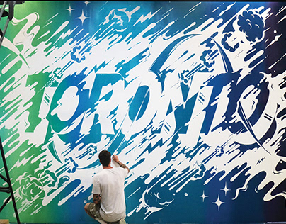
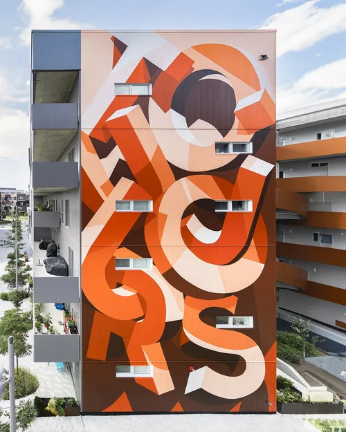
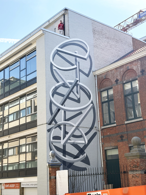
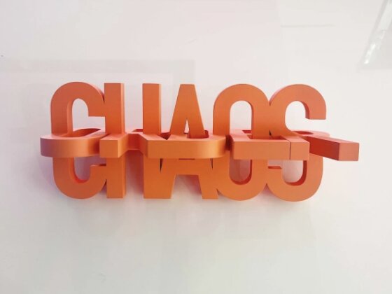
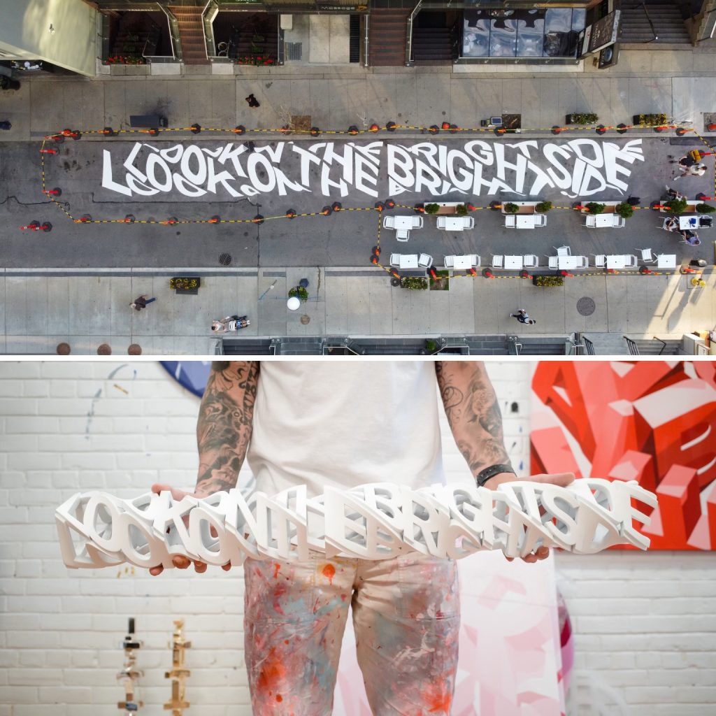
Ben Johnston is a Toronto-based designer from Cape Town, South Africa. He is mainly self-taught after dropping out of a formal industrial/product design program in Cape Town. Ben is an influential typographer for various reasons. One big thing that stands out about him is his ability to combine street art and 3-D elements into a type form; the visuals he is able to create are very distinctive, and he has built his own style throughout the years. His designs usually include overlapping letter elements that connect; to understand the message or phrase being displayed, these elements must be examined and valued over time. Adding on, as the connecting elements Ben produces are another aspect of his significant influence, as it is so different in the sense that the viewer has to essentially decode his designs; this notion encourages viewers to engage with his designs and continuously admire the effort and detail he includes. Ben has pushed his typography and designs outside the typical range normally used to display text in media. It is an inspiration to see someone using their creativity to deliver something fresh to the world that can be used as the starting point for the future of design and typography, and influence more people to step out of their comfort zone.

Ben Johnston standing portrait

His contribution in Typography


The most significant contribution Ben Johnston has made in the field of typography is his ability to not confine within what people find easy in terms of readability; Ben uses type as a way to display a piece of art that is so connected and intertwined with each other, the person looking at his work has no choice but to examine and adore his designs. His work is so significant today because he can use his talents and love for type to tell a story or a message that others will appreciate just as much.


Usually, his designs act as a puzzle needed to be put together by the viewer; the journey it takes for the viewer to understand the message allows them to fully immerse themselves in his work and appreciate all the little details he has included. Another specific example of his contributions through his designs is how he integrates his designs into public spaces. He paints his work on walls, streets, and billboards to further expand his audience around the area. His public integrations extend the world of type outside of a screen and symbolize how typography is always around us and how easily it can fit into common attractions in day-to-day life.

Blue type mural detail

How he has inspired others


His contribution of integrating his designs in public areas has inspired others in the sense that typography can exist in multiple environments. His efforts to make his designs unique have brought attention to his craft and typography as a whole, as people now see the various ways type can be displayed/created. Ben has learned to perfect his style and create seamless, clean designs that can keep someone's attention far beyond what is to be expected when reading a short phrase. His ability to integrate letters so that they all intertwine while still being able to form a phrase has and will continue to inspire people to push what they think limits their typography and find the order in chaos (shout out to his piece “Order/Chaos) to create something that will leave an impact on people. Overall, Ben has an influential impact on his community, interacting with people and creating local points of interest with his designs. He is a reminder that people do not have to feel pressure to stick within a certain group and that breaking out to follow your passion can bring something fascinating out into the world and inspire others to do the same with their own interests.


Purple graffiti installation
Ben signature logo

Analysis of his typeface

Ben's typefaces follow the same style across his designs; he tends to gravitate towards thick, bold sans-serif lettering that grabs an audience at first glance. A drop shadow typically accompanies the typeface to add depth and visual interest. The font below demonstrates the prominence of his typeface and the amount of presence required to fit his adopted style. The typeface has sharp corners, and there is also a slight curve on the edges, adding a subtle, unique element to the font that is barely noticeable at first; this relates to how Ben’s designs often display scrabbled letters that complete a phrase typically noticed after intense observation. The cleanliness of the typeface is in connection to the cleanliness of Ben’s designs; the font further displays the effort it takes to create an overall visually neat and crisp design that looks like it has been digitized on a physical surface. I think that cleanliness is something that is so visually captivating, and it is easy to be admired by it because it demonstrates the hard work, time and effort Ben put in, making it look so put-together. The font also has the ability to be blown up on such a large scale, which also demonstrates the full capability of the font and how usable it is, as demonstrated in his large murals.

ABCDEFGHIJKLMNOPQRSTUVWXYZ

abcdefghijklmnopqrstuvwxyz

123456789

!@#$%^&*

Ben Johnston type collage

Analysis of his designs

This typographic composition is demonstrated on a 2-D surface and a 3-D sculpture. It is an intricate design that displays the phrase “Look on the bright side” in the formation of a long rectangle. The text has an illusion of wrapping around the backside in a continuous loop, displaying a unique overall visual. The 3-D sculpture has been built to have sections of the text pop out to add emphasis around the design. The overall product has additional letters corresponding to the ones around them that seem to be squished; these squished letters act as fillers and guide the viewer's eyes to the letters placed in the centre, as those remain the most similar to the original dimensions of the font. The piece to me has a deeper message than the final product; I see the phrase “Look on the bright side” followed by chaotic, squashed and spiralling letters. This, to me, demonstrates how it is often difficult to look on the bright side in difficult situations; we often get lost in the weight of our stress and fall apart. However, the design is very put-together and connected, which is something to strive for in trying times because they always come and go, and this design reminds us to hold on long enough to experience life outside the stress the difficult moments bring.